For this shoot, I visited Brick Lane because this area of London is known for its graffiti. The images that inspired me to do this shoot came from Nicholas Goodden's selective colouring photograpy where he edits the background of the images into black and white, leaving the the graffiti in colour. Since my theme is fashion and colour I felt that incorporating graffiti into my work was appropriate as they are extremely colourful and is also another way people can express themselves as each art work is unique to the artist and shows individuality like fashion does.
When it comes to framing my photographs, I always take more than 3 images of the same pose and background, this ensures that I have a variety of choices to choose from when selecting photographs to edit and display. If I were to re-do this shoot, I would most likely visit more places in London that has graffiti as, although Brick Lane has a lot, I wasn't able to utilise this due to how high up they were and I wasn't able to frame it properly to fit my model in. I would visit other places known for graffiti such as Shoreditch and especially the Leake Street graffiti tunnel which I believe I could've gotten really good and different shots in. Another thing I would do different is to change my model's outfit to make the pictures look different.
When it comes to framing my photographs, I always take more than 3 images of the same pose and background, this ensures that I have a variety of choices to choose from when selecting photographs to edit and display. If I were to re-do this shoot, I would most likely visit more places in London that has graffiti as, although Brick Lane has a lot, I wasn't able to utilise this due to how high up they were and I wasn't able to frame it properly to fit my model in. I would visit other places known for graffiti such as Shoreditch and especially the Leake Street graffiti tunnel which I believe I could've gotten really good and different shots in. Another thing I would do different is to change my model's outfit to make the pictures look different.


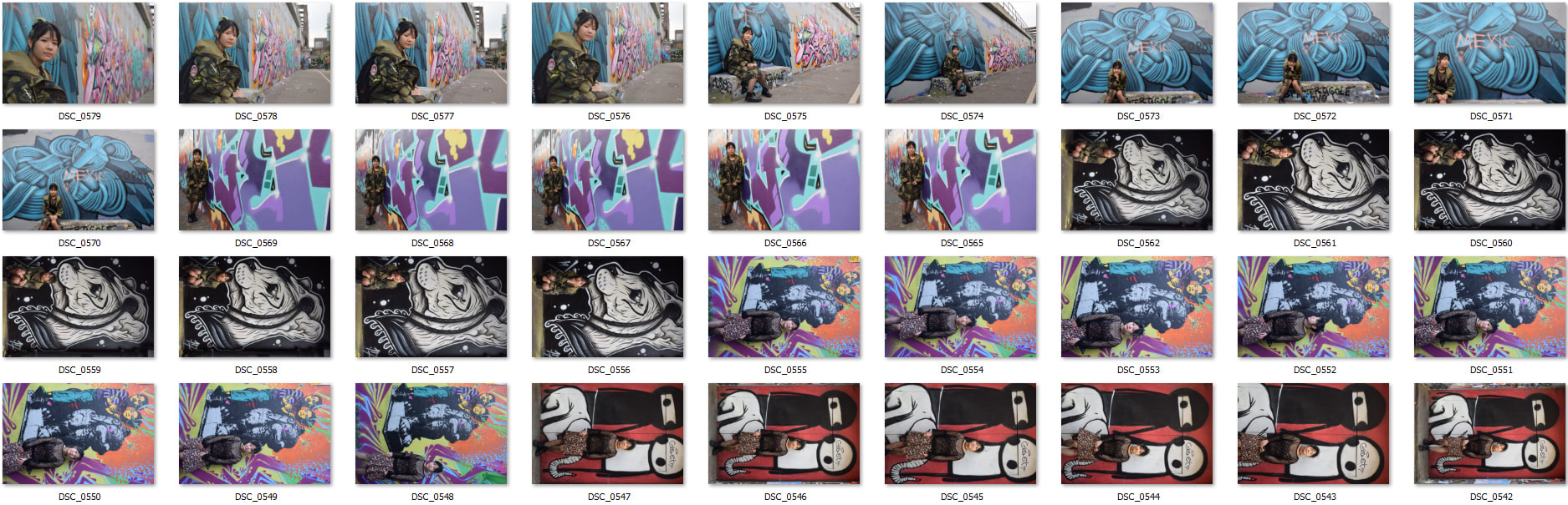
Contact sheet:
Manipulations:


|
The manipulations on the right were also inspired by Nicholas Goodden's selective colouring work, in order to achieve this, I manipulated the images on Photoshop. I used the quick selection tool to select the areas that I wanted to keep in colour and selected the inverse. After selecting the inverse, I filtered the image into black and white, I then adjusted the brightness on both the coloured and black and white parts of the image, I made the graffiti brighter and the rest darker. I did this so that the coloured parts stand out more.
For the second manipulation, I used the exact same process, but I wanted to make the jacket of my model in colour instead to suit my theme more. This makes the viewer focus more on the clothing that the model is wearing rather than the graffiti like the first edit that I did also, the composition of the image adds depth to the image, especially since black and white images can look quite flat with no depth if it isn't positioned and edited correctly.   |
