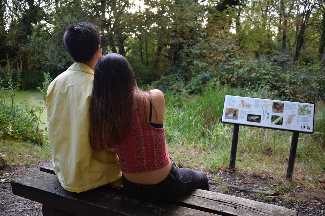
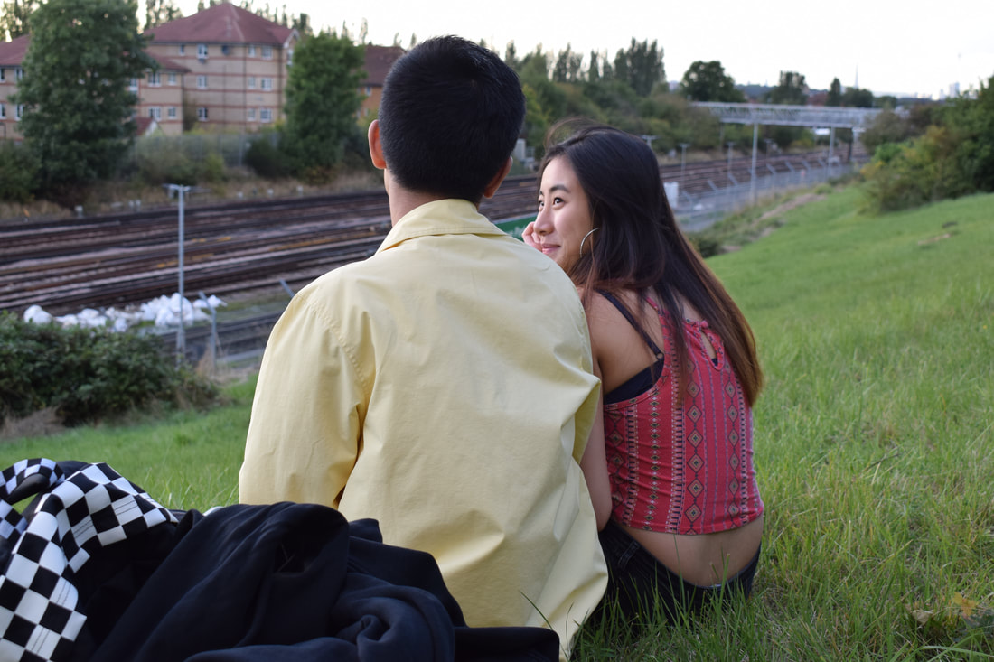
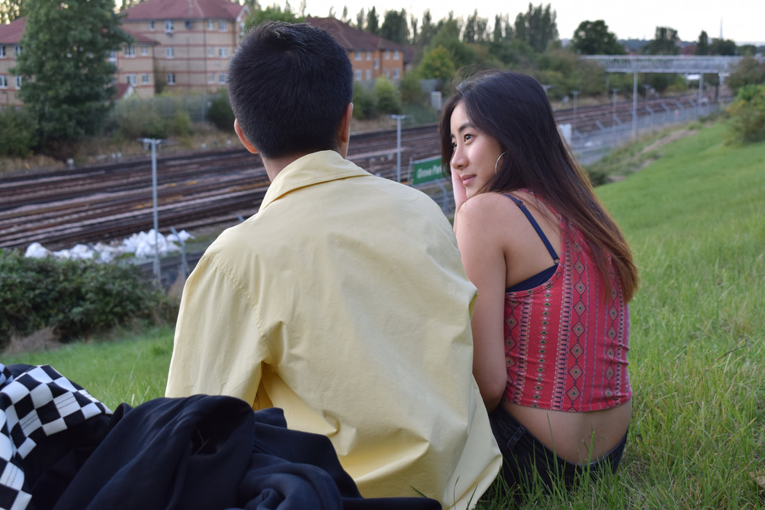
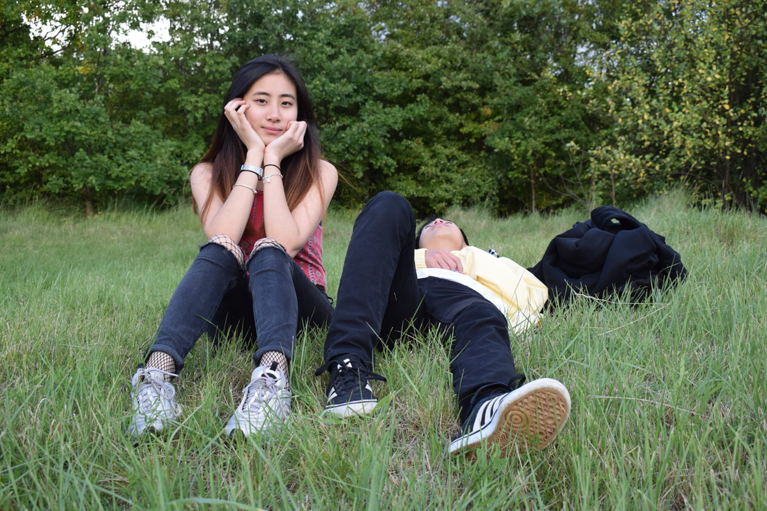
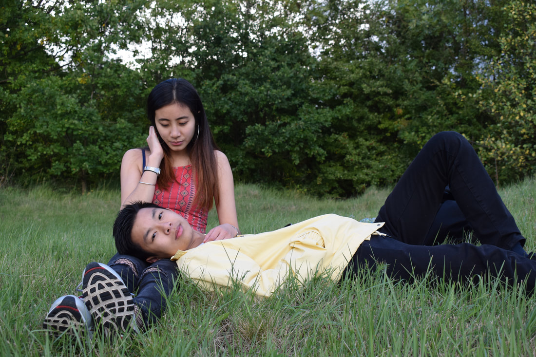
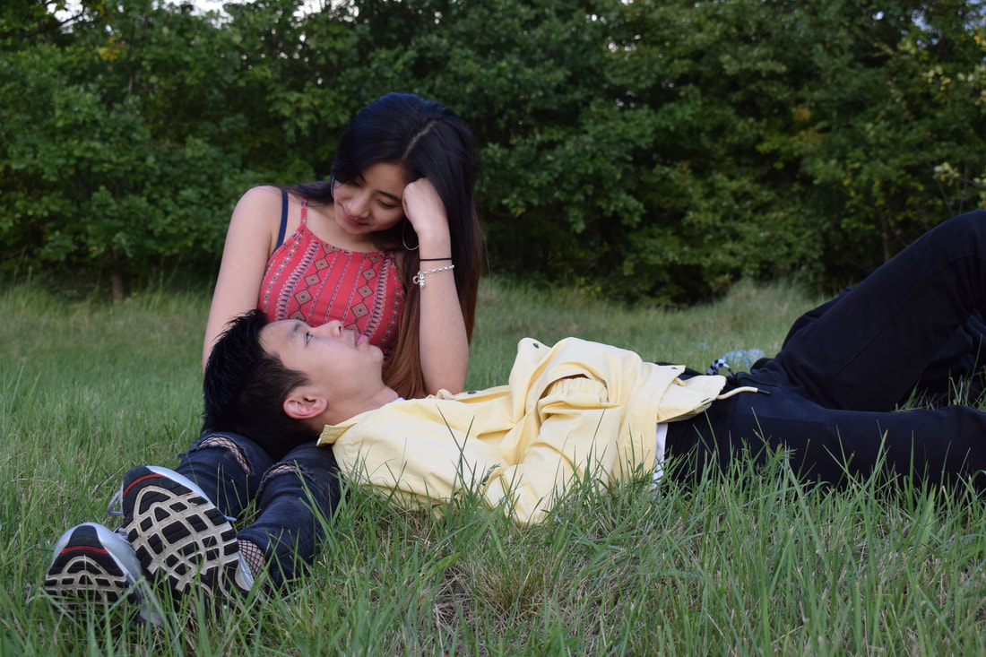
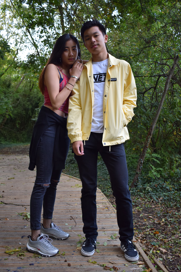
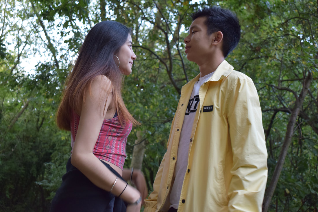
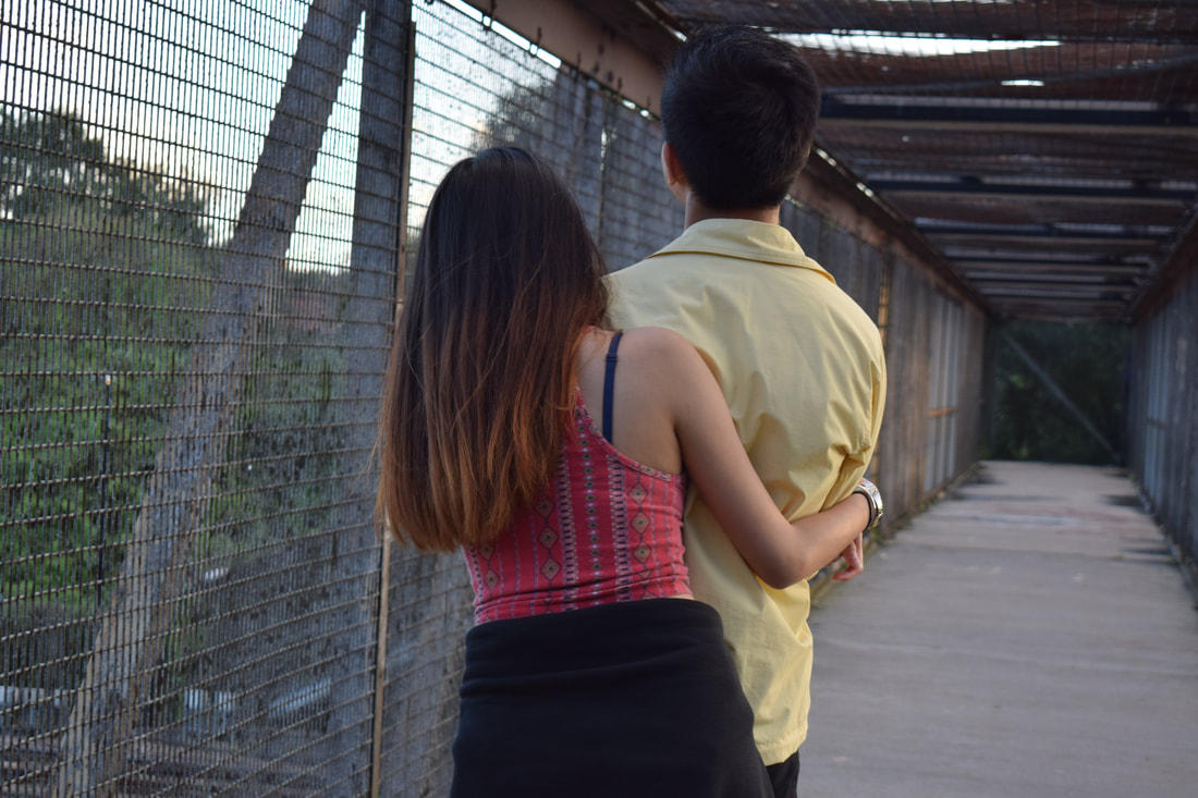
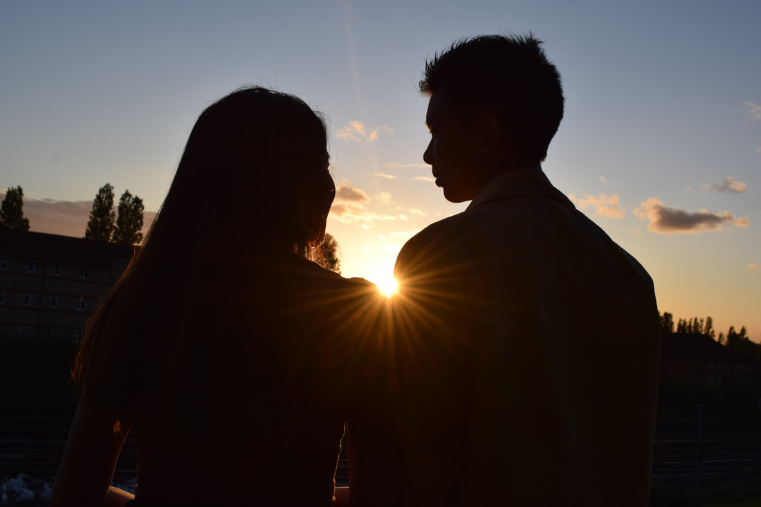
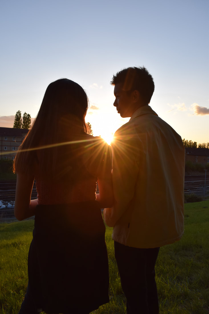
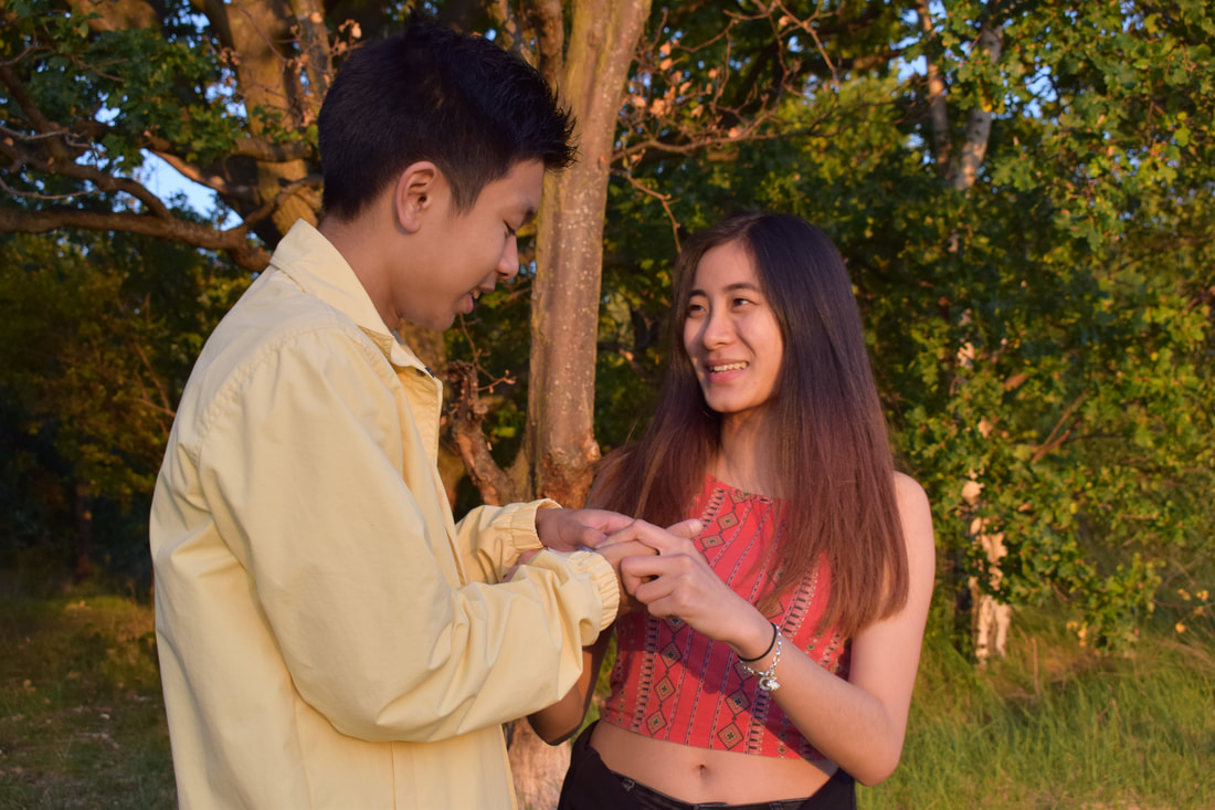
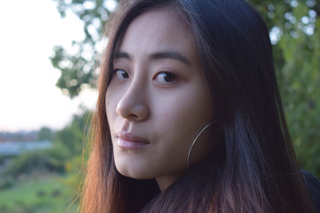
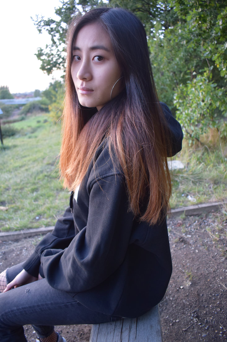
This shoot was inspired by Ailera Stone where she tells tends to tell a story through her images and edits them in an ethereal way, using her as inspiration, I wanted to showcase a story about young love through my images. This shoot took place in Grove Park, Bromley, I wanted the shoot to take place in a location with a lot of greenery and nature since that is what Ailera Stone usually incorparates into her work. My personal investigation is based on fashion and colour and I wanted to include specific colours into the shoot such as red, yellow and black, these particular colours represent emotions of love, happiness and grief respectively. From this shoot, I wanted to take the viewers through the couple's story, I wanted them to feel the emotions of the models that are present within the photographs.
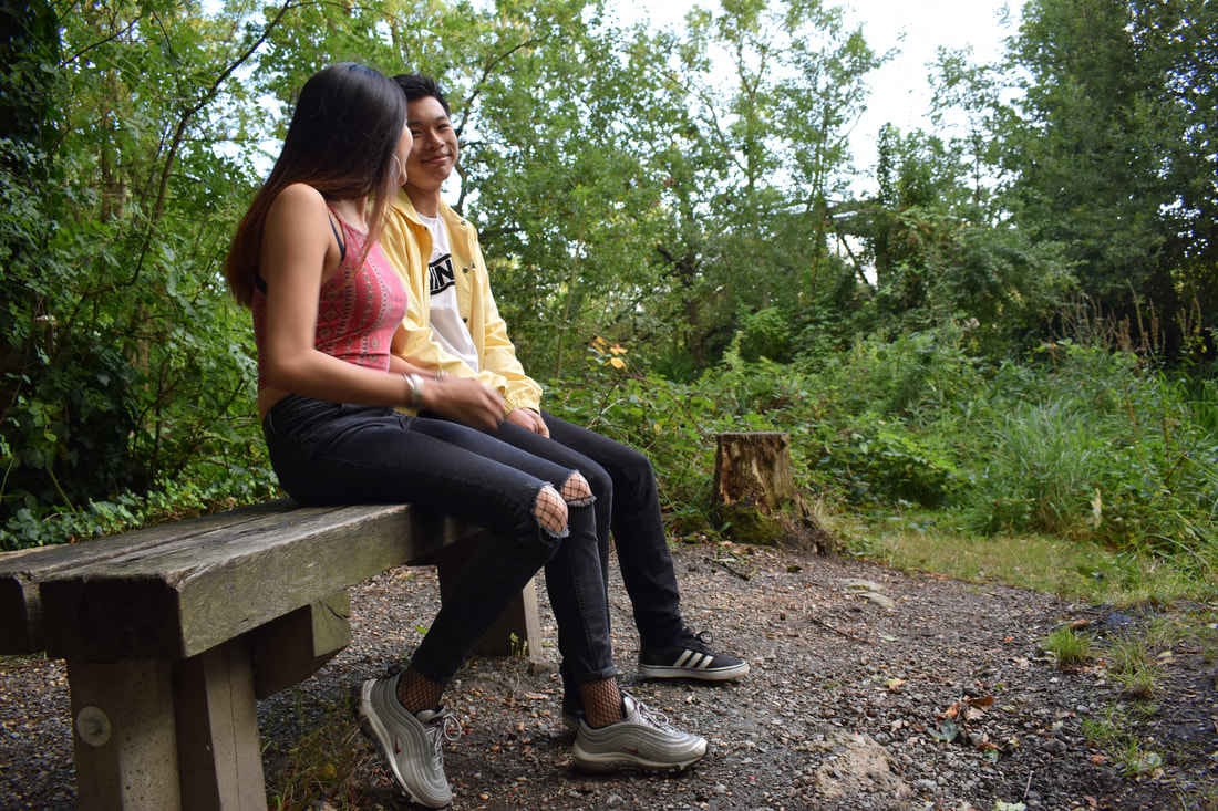
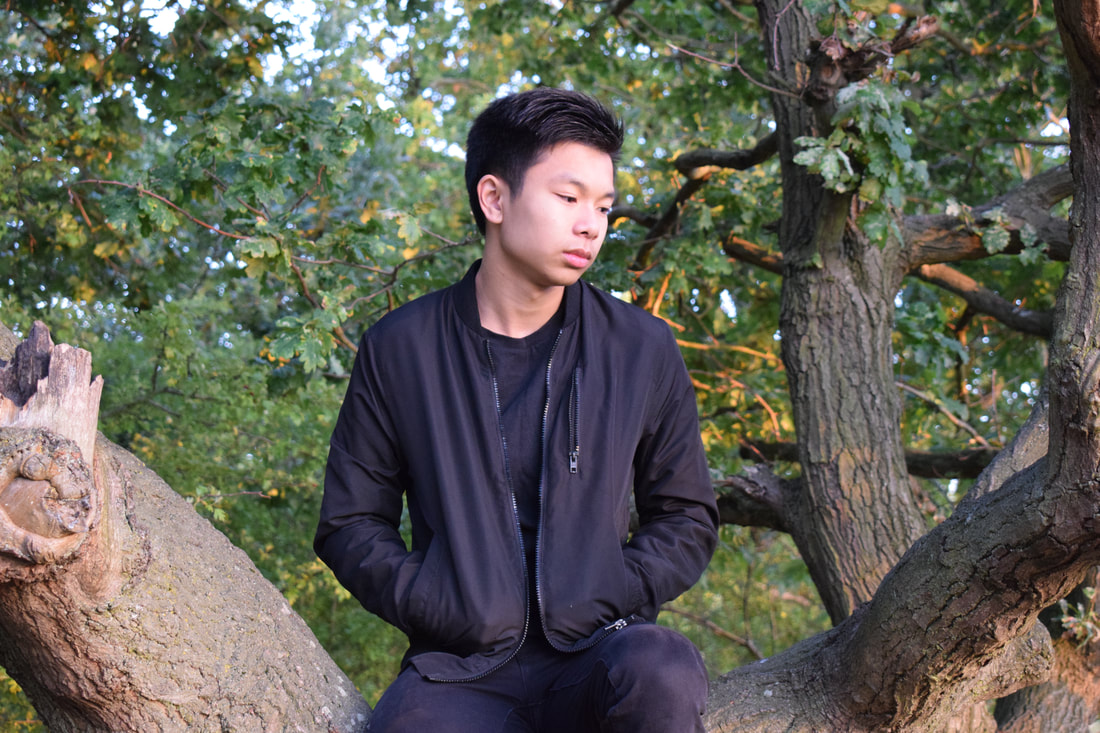
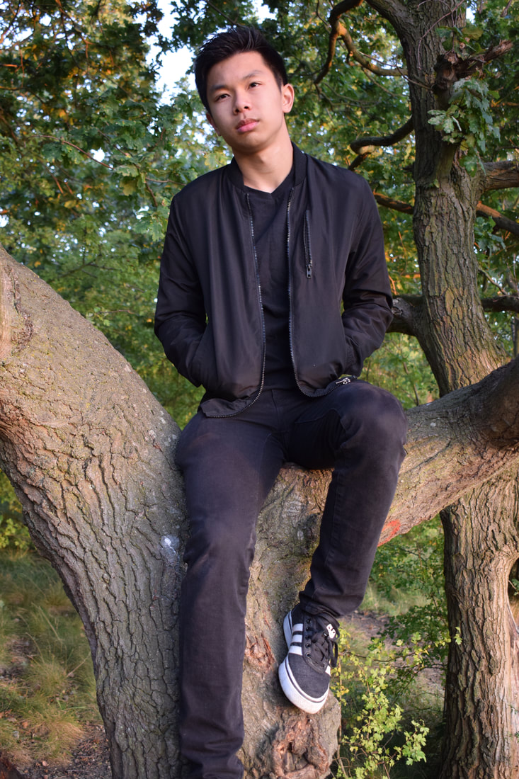
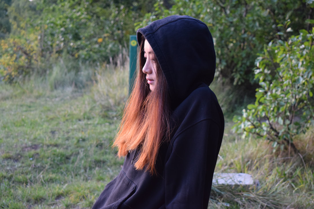
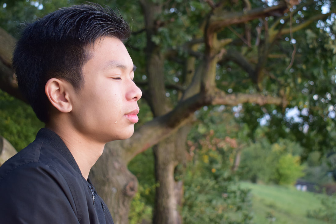
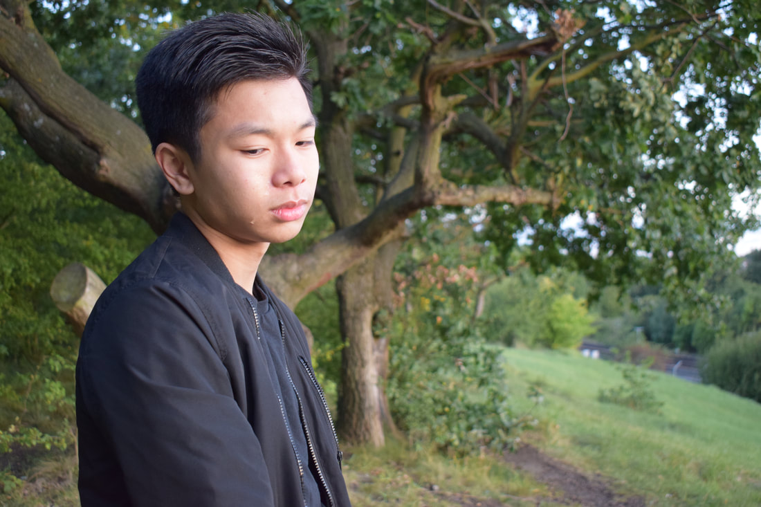
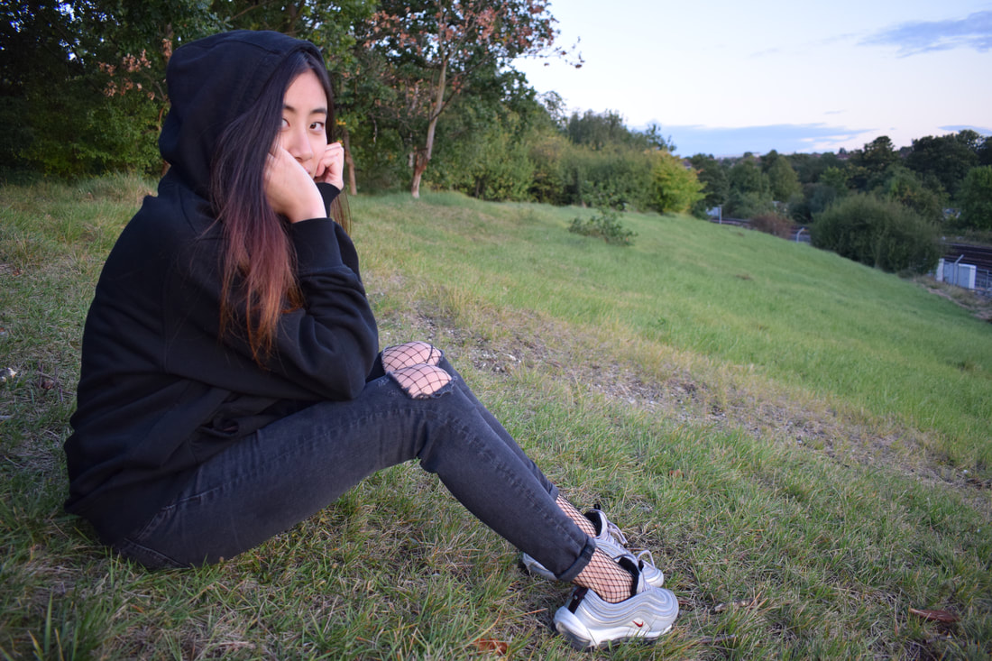
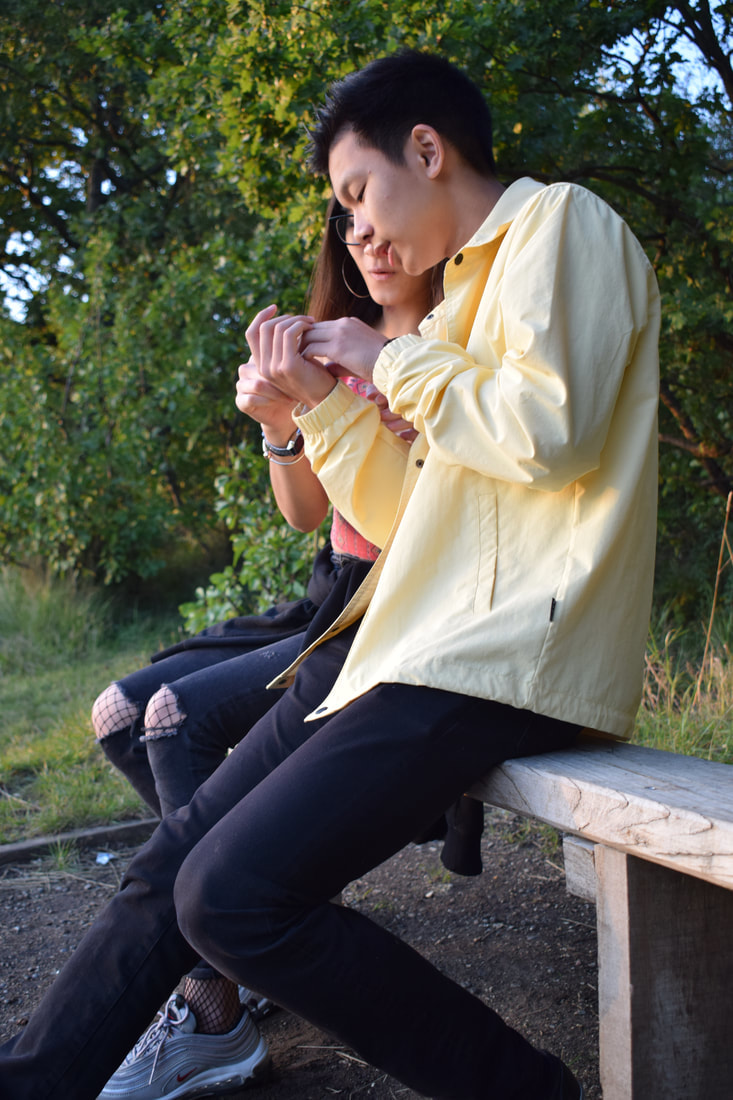
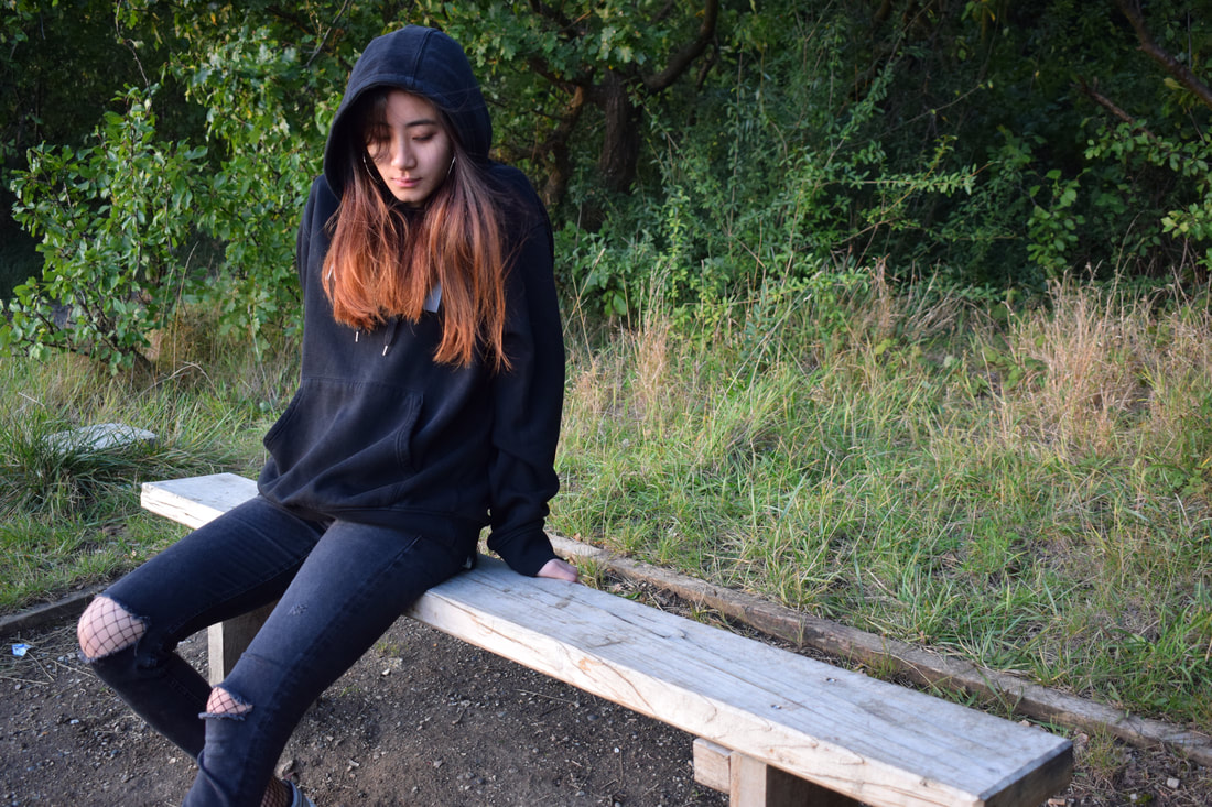
For the first part of the shoot, I wanted to represent the 'honeymoon phase' of a relationship, which is the beginning of the relationship where couples are extremely happy and in their own bubble, I wanted the viewer to see the chemistry between them and feel the happiness that is present in the images. Yellow and red are the main colours of this part of the shoot, yellow represents happiness and red represents passion and love, this is what I expect a relationship to have in the beginning. The colour black is the main colour for the second part of my shoot, the colour itself represents power and masculinity, but is more commonly known as a negative colour that is associated with death. I wanted the pictures to showcase the grief that people feel after a breakup and I asked my models to keep a blank face for the photographs as I wanted it to act as if they're barely keeping their life together and in some other shots they're looking down as if they're longing for their partner.
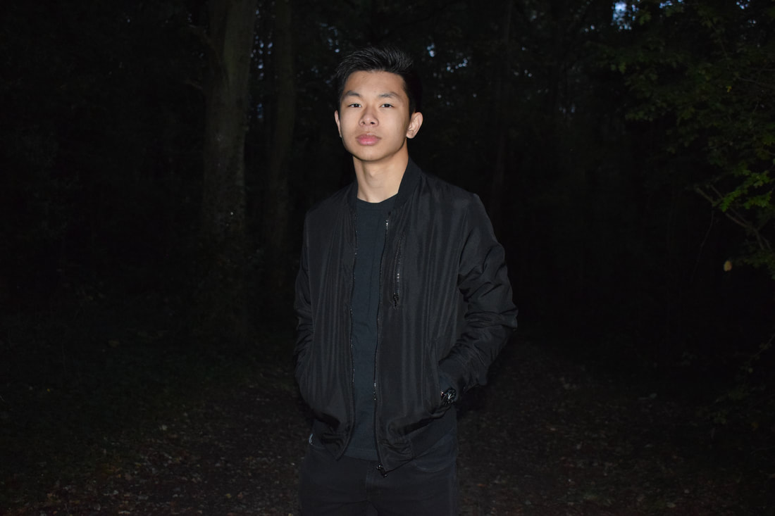
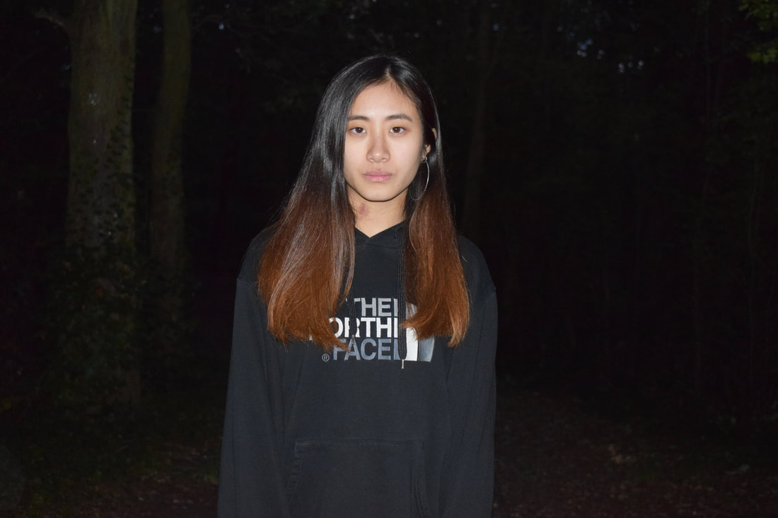
For this part of the story, I wanted to take only individual shots, this helps to keep with the concept of grief and the expressions helps the viewer to relate to the models more and sympathises with them.
I felt like this shoot was somewhat successful with the outcome I had in mind, but being my first shoot, I felt that I could have improved and taken a better shot. If I were to improve this shoot, I most likely would have taken more pictures in order to make the transition between the 'honeymoon phase' and the 'breakup' smoother, if I did this it would make the images seem more like an actual story.
For the first part of the shoot, I wanted to represent the 'honeymoon phase' of a relationship, which is the beginning of the relationship where couples are extremely happy and in their own bubble, I wanted the viewer to see the chemistry between them and feel the happiness that is present in the images. Yellow and red are the main colours of this part of the shoot, yellow represents happiness and red represents passion and love, this is what I expect a relationship to have in the beginning. The colour black is the main colour for the second part of my shoot, the colour itself represents power and masculinity, but is more commonly known as a negative colour that is associated with death. I wanted the pictures to showcase the grief that people feel after a breakup and I asked my models to keep a blank face for the photographs as I wanted it to act as if they're barely keeping their life together and in some other shots they're looking down as if they're longing for their partner.
For this part of the story, I wanted to take only individual shots, this helps to keep with the concept of grief and the expressions helps the viewer to relate to the models more and sympathises with them.
I felt like this shoot was somewhat successful with the outcome I had in mind, but being my first shoot, I felt that I could have improved and taken a better shot. If I were to improve this shoot, I most likely would have taken more pictures in order to make the transition between the 'honeymoon phase' and the 'breakup' smoother, if I did this it would make the images seem more like an actual story.


|
|
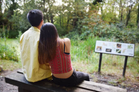
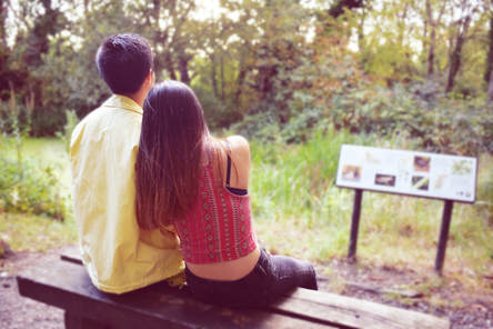
I wanted to connect both parts of the story, so I decided to shoot at the same place at a different time, for the first image on the left, it shows the couple on a bench and the second image is the female model on her own looking at the bench longingly, as if she is reminiscing her past relationship. The viewer can make the connection by looking at the images and this will make them pity her and possible even feel her pain. |
Contact sheet:
Manipulations:
|
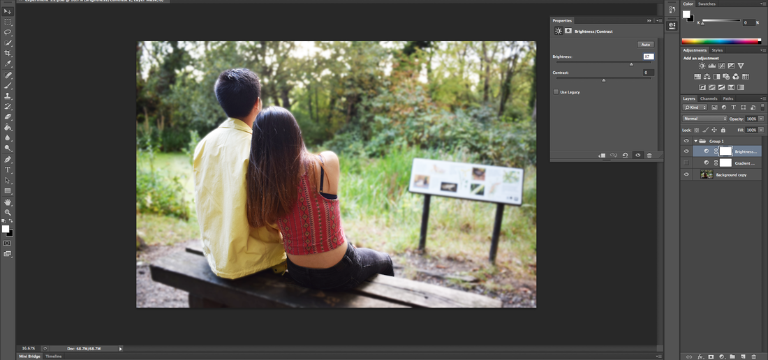
For this manipulation, I wanted to edit my pictures in a way that suits Ailera Stone's work more, her work has an ethereal feeling towards it and they are quite dramatic and some of them have quite a soft undertone, this is what I used as inspiration for my edits. The image that I chose to edit already were quite bright and colourful but, I felt like it was not bright enough therefore, I brightened the image creating a new adjustment layer to change the brightness. Once I felt that it was bright enough, I wanted to blur the background in order for the models to stand out more, to do this, I used the quick selection tool to select the models and selected the inverse since I want to blur the background. To blur it, I used the gaussian blur tool.
 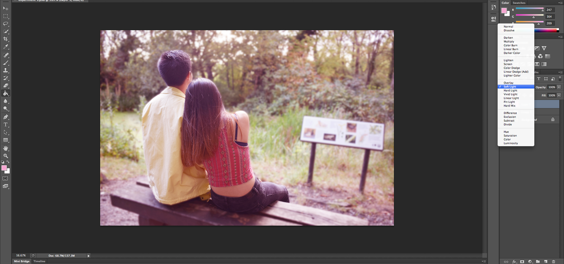 For the second edit, I tried to add a colour filter over the first edit since I wanted to incorporate the theme of colour into my work. I chose the colour pink since it represents love and intimacy, it is associated with gentleness nurture, which I feel can characterise this image perfectly. I created a new layer and filled it in with a light pink, I then selected 'soft light' this allowed the image below to show whilst filtering it with a soft pink. A simpler way of creating a filter is to use the 'photo filter' option in photoshop, this automatically adds a coloured filter.
|
|
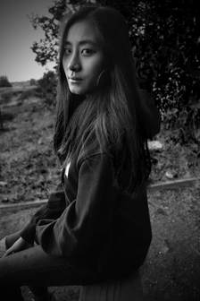
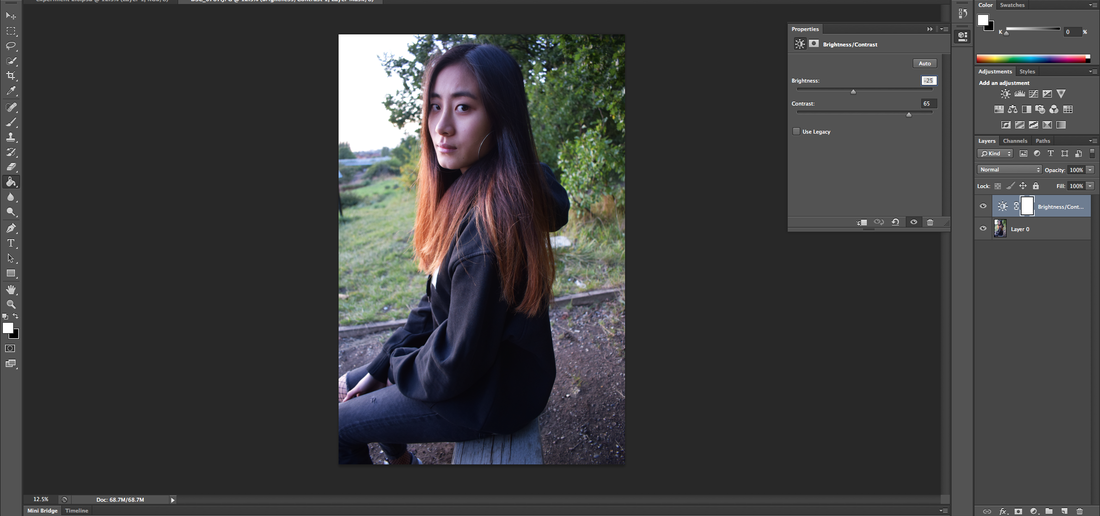
The picture I decided to edit is of my female model sitting on a bench and staring directly at the camera with a blank face, it was staged this way because I wanted to make it seem like she's reminiscing about her former relationship. This particular picture matches with another image that I took, where she is on the same bench, but with her other half, so it is almost like a sacred place for her. I asked her to keep a blank face because personally I found it more realistic than trying to force a sad one. |

|
|
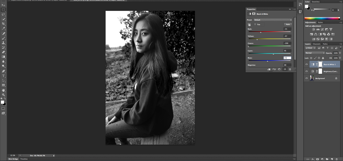  |
The photos on the right is a before and after of the edit that I did, since this is a 'breakup' image, I wanted to darken the photograph a bit to represent the stress of a breakup therefore, I turned the photo to black and white and made the red tones, green tones, yellow ones and blue tones slightly darker. This adjusted different parts of the image making them darker, the particularly made the red tones in the image much darker which darkened the model's under eye. This was unintentional as I was experimenting with the different features of Photoshop, but I really like the outcome. The dark under eyes give off the mood of longing and shows the effects of what a breakup can do to a person.
|
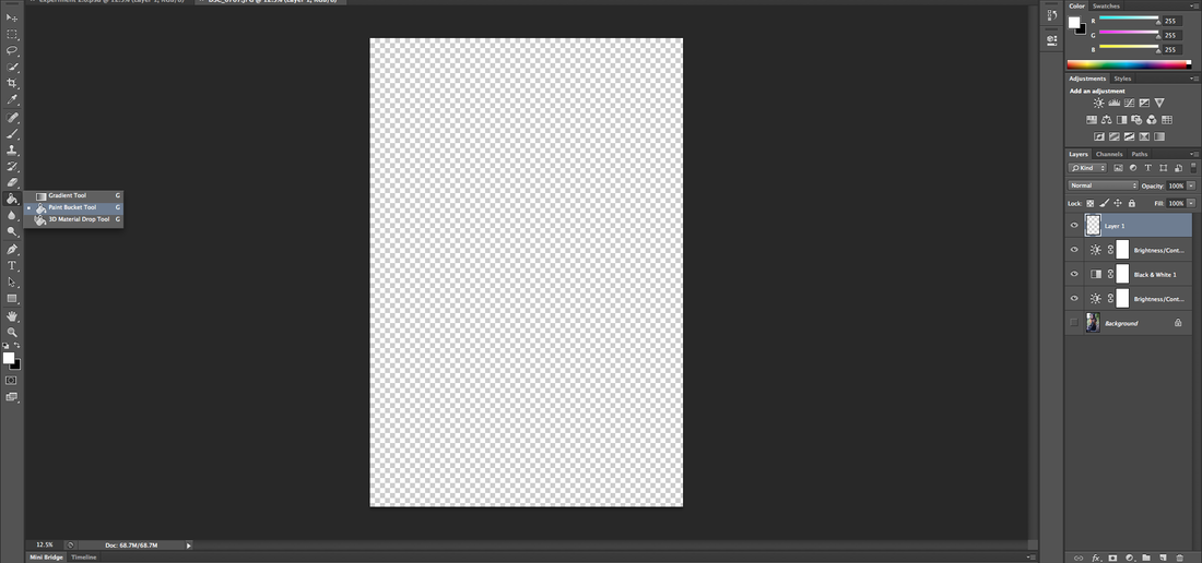 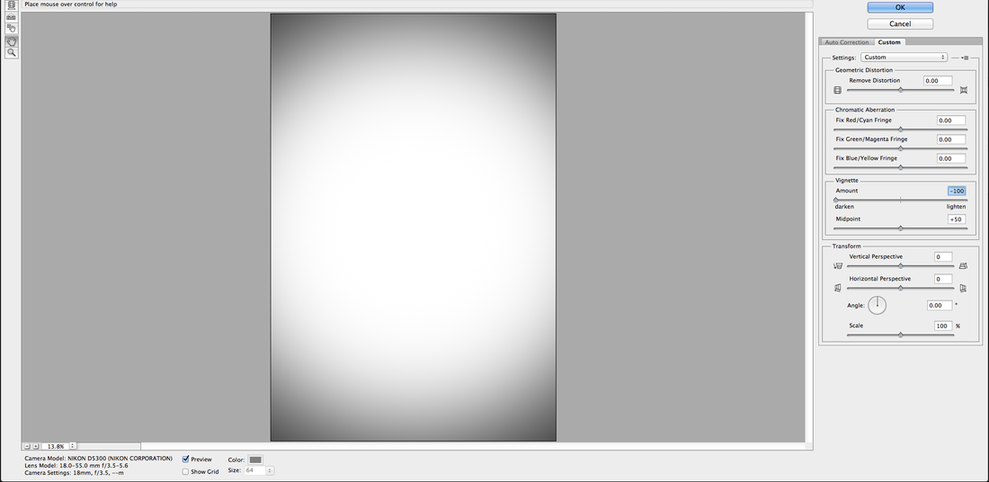 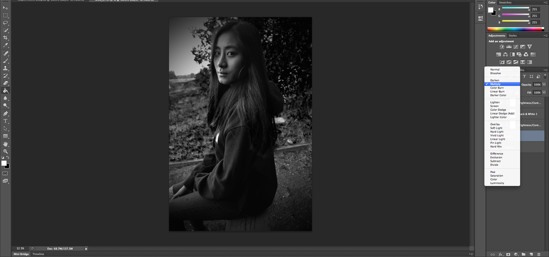 |
Once I was satisfied with the colour of the image, I wanted to dim the photo even more, but not too much that it loses sight of everything else, so I decided to add a vignette border instead, this darkens only the edges of images. In order to create the vignette border, I had to add a new layer and filled it with white, I then proceeded to click 'lens correction' under the filter tab and adjusted the vignette to the lowest. Using the blend mode, I changed it from 'normal' to 'multiply' which lightens the layer to show the second one.
|
